Designing for a vector based font.
With a lego man at hand I began sketching outlines of the shapes before bringing them into a font creation tool.


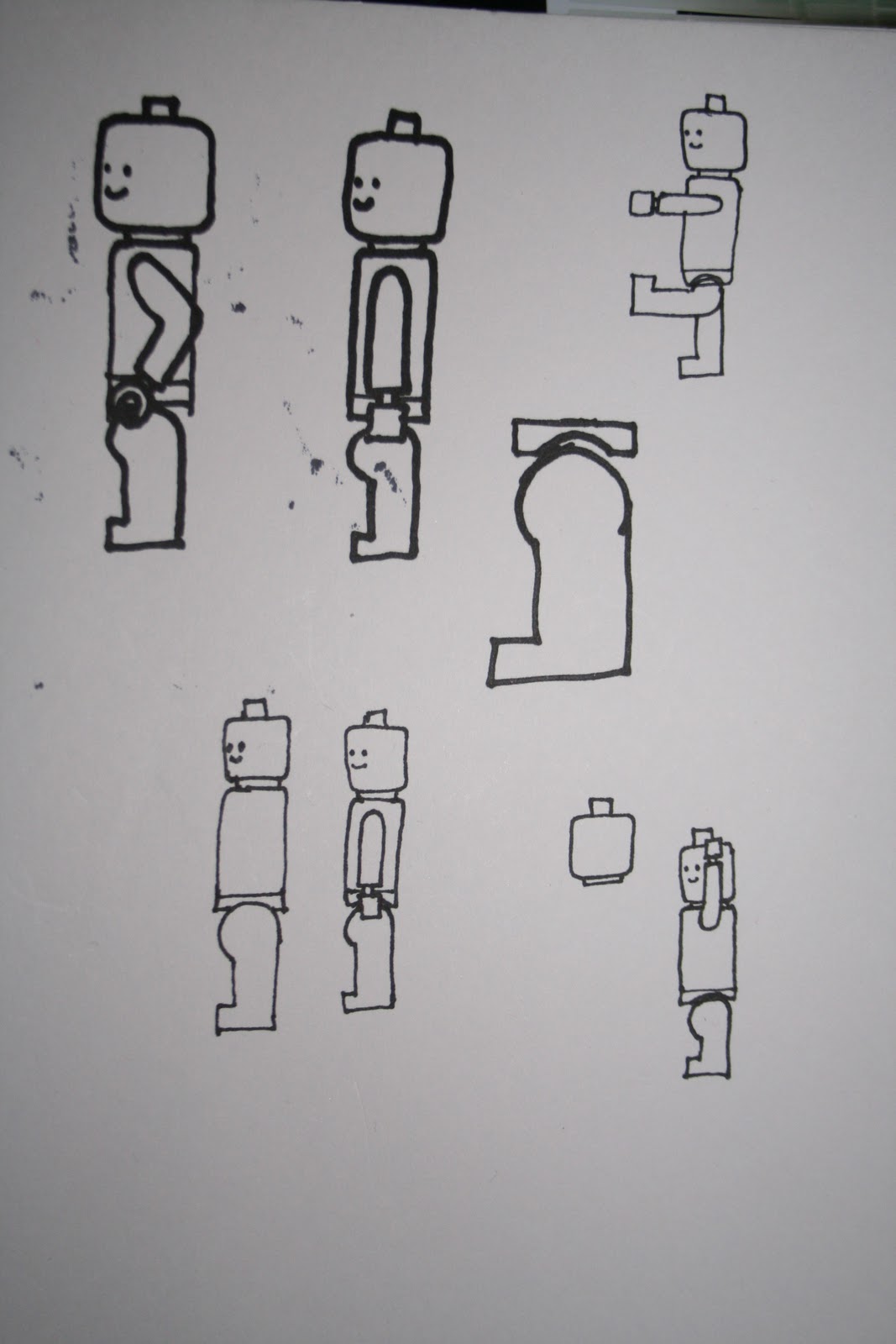

Placing a grid over the photos and sketch allowed for a closer approximation of the proportions.


After finding a satisfying scale and line thickness I created lego men and a few poses and quickly tried them out in a text preview. As the design stands they are far too complicated and detailed to be used effectively. The image based lego men font was far more effective but more as a comic one of font, not for regular use. It is clear that this media test is facing its end. There is the possible rout of simplifying the shapes through abstraction before bringing them back into text which may be the final push of this particular project.

It's Raw. It's Primeval. Steak Tartare. from The D4D on Vimeo.